I fired my job last week. Since most of the money I was making was just going across the street to the daycare for our 11-month-old, my wife and I agreed that letting the job go was the best solution. Especially since I never broke the $40K/year ceiling the entire 6 and a half years I was there.
Years with no raises were the sacrifice I paid so that when the opportunity presented itself, I would at least have the experience at that job to boost me towards the next step. Clearly, that experience and knowledge was never factored in when it came time to seek the replacement for my Supervisor, Lorrie. The questions were tailored to exclude my experience, skills and background. It was all specifically designed to exclude me from the promotion. I was good enough to do both my job and the supervisor position for the 3 month period in between Lorrie retiring and the interview process, but not good enough to actually be hired for the position.
The thing about firing them is that I still had a great amount of potential and the promotion was a huge part in fulfilling that potential. So I am left with feeling that I left something that I didn't get the chance to finish the way I wanted. Recognizing that is key to getting over it and moving on to my next great adventure.
Now I get the chance to raise my 11-month-old daughter at home and play with my 6-year-old for the summer. In addition to being Mr. Mom, I get to spend any extra time on creative things like my art and freelance graphic design. And maybe some laundry and cleaning bathrooms like a good Mr. Mom should.
So, yes, I like to view this as me firing my employer rather than quitting my job. I also hope to look back on this and see it as the best decision I ever made, besides asking my wife to marry me.

Tuesday, April 10, 2012

Friday, February 24, 2012
Great What?
So I refilled the printer at work and was unwrapping the package it came in. Something about the package didn't seem right. It was Hammermill's Great White. The sharks didn't look right. They didn't look like Great White Shark(s) to me (it's actually one shark, that was duplicated, but hey, they're a paper company, right?).
See, I've been drawing sharks since I was a kid, so there are a few things I noticed about the anatomy of a shark, particularly the great white shark.
So the picture didn't sit well with me and so I start studying it a little more and determine that it's not a Great White Shark but a Bull Shark.
Tomato, Tomahhto you say? Well, think about that the next time you take a bite out of a Habanero chili instead of a Pablano. If course, you will be too busy drinking water or shoving ice in your mouth to say much, just make the hit stop, Mommy!
This is like making an Apple Pie with McIntosh apples, close but no cigar. It's going to taste totally different. Totally.
So why do I care? Well, first, I caught it, do there's that. Secondly, it's not correct. Like a misspelled word in a letter to a College Admissions Board, it's going to count against you.
Thirdly, who can't do the requisite research on something that is going to be printed millions of times so that they don't look like idiots when someone DOES notice?
Any shark will do. Just slap one up there. Hell, put a frog, what does it matter to me? It's just sloppy design.
See, I've been drawing sharks since I was a kid, so there are a few things I noticed about the anatomy of a shark, particularly the great white shark.
So the picture didn't sit well with me and so I start studying it a little more and determine that it's not a Great White Shark but a Bull Shark.
Tomato, Tomahhto you say? Well, think about that the next time you take a bite out of a Habanero chili instead of a Pablano. If course, you will be too busy drinking water or shoving ice in your mouth to say much, just make the hit stop, Mommy!
This is like making an Apple Pie with McIntosh apples, close but no cigar. It's going to taste totally different. Totally.
So why do I care? Well, first, I caught it, do there's that. Secondly, it's not correct. Like a misspelled word in a letter to a College Admissions Board, it's going to count against you.
Thirdly, who can't do the requisite research on something that is going to be printed millions of times so that they don't look like idiots when someone DOES notice?
Any shark will do. Just slap one up there. Hell, put a frog, what does it matter to me? It's just sloppy design.
Thursday, February 23, 2012
Cool Business Cards
I got a call from an old friend (and client) about doing a refresh on his business cards. My friend is the kind of client that Designers love; open-minded about ideas, creativity and can see the big picture when it comes to laying out money to attain those goals.
So when I created his business cards back in 2006, they were stretching the boundaries as far as using newer materials and techniques.
What we created were cards that make an impact, are memorable and durable. They are durable physically but in another way as well. The cards have a perceived value to them, so they are much more likely to be kept and not thrown away. And isn't that the point of having a business card?
The cards are made if 3mil plastic, transparent but with a three color design on them (red, black and white inks). Brian swears by these, he says that his cards always make a positive impression and his contacts usually make a comment about them.
We are just now beginning the process if refreshing this with a newer design but boy did the old design make a great impact.
Here is what they look like up close:

So when I created his business cards back in 2006, they were stretching the boundaries as far as using newer materials and techniques.
What we created were cards that make an impact, are memorable and durable. They are durable physically but in another way as well. The cards have a perceived value to them, so they are much more likely to be kept and not thrown away. And isn't that the point of having a business card?
The cards are made if 3mil plastic, transparent but with a three color design on them (red, black and white inks). Brian swears by these, he says that his cards always make a positive impression and his contacts usually make a comment about them.
We are just now beginning the process if refreshing this with a newer design but boy did the old design make a great impact.
Here is what they look like up close:
Thursday, February 16, 2012
Pins for "Read. Think. Act."
I got these today in the mail. The vendor turned them around in less than two weeks. They turned out well and there is a stamped "Made in the USA" on the back, which is a consideration for me when buying stuff like this.
I am surprised in the quality of the pins, they aren't die-struck, the graphic was laid in and then some sort of polymer or resin covers it. Very nice printing, very crisp. Nice contrast and decent turnaround for a product of this type.
Ask Catherine Read for one if you see her, I bet she will have a few on her at all times.


I am surprised in the quality of the pins, they aren't die-struck, the graphic was laid in and then some sort of polymer or resin covers it. Very nice printing, very crisp. Nice contrast and decent turnaround for a product of this type.
Ask Catherine Read for one if you see her, I bet she will have a few on her at all times.
Bumper Stickers and Lapel Stickers
I ordered these about a week ago and they arrived only 6 days later. Great service from my vendor!
Catherine is going to love these!

Catherine is going to love these!
Thursday, January 26, 2012
More Buttons
We got more buttons this week for our client (and friend, and neighbor), Catherine Read, who is running for City Council.
I did the design of the look and feel for her campaign, a bright green with gold highlights. She got her degree from George Mason University so that was the inspiration for her "colors".
Catherine has been involved with the local politics for the good part of the last decade because she really does care for the City and wants to improve it. We support her in her efforts and are very proud she is taking this big step in getting involved with her community and serving civically.
Go Cat, Go!

I did the design of the look and feel for her campaign, a bright green with gold highlights. She got her degree from George Mason University so that was the inspiration for her "colors".
Catherine has been involved with the local politics for the good part of the last decade because she really does care for the City and wants to improve it. We support her in her efforts and are very proud she is taking this big step in getting involved with her community and serving civically.
Go Cat, Go!
Tuesday, January 17, 2012
15 or 75?
I ran across this ad at the mall and had to try and decipher if they mean 15 or 75. Either way it seems like a great deal but I really think of you are going to use a decorative font, make sure that it's readable.

Wednesday, March 9, 2011
Today I Learned What FUD Means
I was perusing the web and came across an article on Square and their credit card reader. Apparently, a rival company's CEO, not some marketing weasel, decided to announce that there were security problems with the system and to be aware of it.
The guy produced a YouTube video that showed how an alternate program was created and run on the iPhone which looks like the Square app but can be used to take credit card numbers after they have been swiped and can, get this, store them so that they can be used again (illegally, of course). Someone should have told this guy that there already was a technology out there that has been around for ages that does the exact same thing; its called a pencil and paper.
If someone wanted to keep that information and exploit it, the user gave them the card already, just as they would while using their rival system.
So in the end, this CEO comes across as such an arrogant ass for producing a video that shows how a rivals software can be exploited and then puts the software out there as a proof that this can be done, opening up himself and his company up to all kinds of lawsuits and proving nothing more than that he is scared of Square.
FUD is short for "Fear", "Uncertainty" and "Doubt", which is a classic marketing gimmick to create these feelings in customers to get them to not use your rivals product, which will get them to use yours. This guy failed big time and should probably be shown the door. Horrible PR mess this guy has created for himself and his company.
Here is the story, its a great read. Click Here
The guy produced a YouTube video that showed how an alternate program was created and run on the iPhone which looks like the Square app but can be used to take credit card numbers after they have been swiped and can, get this, store them so that they can be used again (illegally, of course). Someone should have told this guy that there already was a technology out there that has been around for ages that does the exact same thing; its called a pencil and paper.
If someone wanted to keep that information and exploit it, the user gave them the card already, just as they would while using their rival system.
So in the end, this CEO comes across as such an arrogant ass for producing a video that shows how a rivals software can be exploited and then puts the software out there as a proof that this can be done, opening up himself and his company up to all kinds of lawsuits and proving nothing more than that he is scared of Square.
FUD is short for "Fear", "Uncertainty" and "Doubt", which is a classic marketing gimmick to create these feelings in customers to get them to not use your rivals product, which will get them to use yours. This guy failed big time and should probably be shown the door. Horrible PR mess this guy has created for himself and his company.
Here is the story, its a great read. Click Here
Saturday, January 8, 2011
New Starbucks Logo
Starbucks changed its logo this week, the first change in 19 years. The graphic below shows the progression.

As a side note, I came upon, what could very well be the inspiration for the logo. Its from a building in Milan, Italy.


As a side note, I came upon, what could very well be the inspiration for the logo. Its from a building in Milan, Italy.

Tuesday, January 4, 2011
Great Design Diagram
This is from a fellow Designer named Colin Harman, you can get one of these at his online shop Here.


Saturday, November 7, 2009
Resolution
I'm not talking about a New Years resolution, the kind you break a few weeks after you make it. I'm talking about resolution as it applies to images and graphics. Any raster image has resolution. What? What's Raster you say? Well, there's two different types of graphic images, Raster(-based) and Vector(-based).
Let me give you a few examples:
A Vector image is made up from primitives such as points, lines, curves or polygons which are based on mathematical equations. Vector images are very precise and flat.
Raster images are bitmaps. A map of pixels generally formatted into a rectangular grid.
Vector-based graphics are sharp and resolution-independent. So no matter how big you stretch it or blow it up, the resolution will stay the same.
With Raster-based images, the bigger you make it, the more pixels you need so the image doesn't breakdown and become pixellated. (example)
By definition, raster-based files get bigger with the additon of more resolution and vector-based images will stay the same file size always.
When you get a logo done, make sure you get the file in a vector-based format, otherwise it will cost you more to get the file converted to vector, if needed. You can easily convert a vector to raster, but not so easy to convert the other way.
When people take pictures with their digital cameras, the resolution is of vital importance. Many novice users will set their cameras to capture the images in a medium or low resolution setting. This is done to save space since smaller resolution images take up less space and will not fill up a memory card. Sometimes its done because the user is happy with their resolution when they view it on screen and never prints the images.
The important thing about resolution when dealing with a digital camera is that you have a limited opportunity to capture a moment, so you want to get the best image possible. So make sure that the resolution is set as high as the camera allows. You can always down-sample the image later if you want to save it smaller. If you take a small picture from the beginning, you don't have that option.
I can't tell you how many times I get images from people that have been taken off of a web site. The resolution that is found on a web site is 72dpi (dots per inch). Sounds like a lot, but it isn't when you consider that printed media is usually 300dpi. But you say that the image on screen looks just as good as the one on the post card. How could that be? Your eye is much more forgiving of an image that is viewed on a computer screen than on a printed page. As far as the printed image goes, you can get away with 120 or 150dpi just fine, for the most part. But the standard is 300dpi for the best image quality.
So just stretch the image? What? Um, sounds good in theory, but in reality, the quality leaves a lot to be desired. For one, you can't "make-up" pixels. Stretching will just stretch the image and create a pixellated look.
Let me explain it this way; remember when you used to watch TV on a traditional tube? The image was 640 or 800 pixels across. Well now we have HDTV now and if you have watched that in comparison to older TV, you notice how much richer the images are much richer because of the higher resolution. Nobody wants to trade their HDTV in for an old one, its a downgrade. The reason is because that new HDTV offers 1080 pixels across instead of 640 or 800.
Let me give you a few examples:
A Vector image is made up from primitives such as points, lines, curves or polygons which are based on mathematical equations. Vector images are very precise and flat.
Raster images are bitmaps. A map of pixels generally formatted into a rectangular grid.
Vector-based graphics are sharp and resolution-independent. So no matter how big you stretch it or blow it up, the resolution will stay the same.
With Raster-based images, the bigger you make it, the more pixels you need so the image doesn't breakdown and become pixellated. (example)
By definition, raster-based files get bigger with the additon of more resolution and vector-based images will stay the same file size always.
When you get a logo done, make sure you get the file in a vector-based format, otherwise it will cost you more to get the file converted to vector, if needed. You can easily convert a vector to raster, but not so easy to convert the other way.
When people take pictures with their digital cameras, the resolution is of vital importance. Many novice users will set their cameras to capture the images in a medium or low resolution setting. This is done to save space since smaller resolution images take up less space and will not fill up a memory card. Sometimes its done because the user is happy with their resolution when they view it on screen and never prints the images.
The important thing about resolution when dealing with a digital camera is that you have a limited opportunity to capture a moment, so you want to get the best image possible. So make sure that the resolution is set as high as the camera allows. You can always down-sample the image later if you want to save it smaller. If you take a small picture from the beginning, you don't have that option.
I can't tell you how many times I get images from people that have been taken off of a web site. The resolution that is found on a web site is 72dpi (dots per inch). Sounds like a lot, but it isn't when you consider that printed media is usually 300dpi. But you say that the image on screen looks just as good as the one on the post card. How could that be? Your eye is much more forgiving of an image that is viewed on a computer screen than on a printed page. As far as the printed image goes, you can get away with 120 or 150dpi just fine, for the most part. But the standard is 300dpi for the best image quality.
So just stretch the image? What? Um, sounds good in theory, but in reality, the quality leaves a lot to be desired. For one, you can't "make-up" pixels. Stretching will just stretch the image and create a pixellated look.
Let me explain it this way; remember when you used to watch TV on a traditional tube? The image was 640 or 800 pixels across. Well now we have HDTV now and if you have watched that in comparison to older TV, you notice how much richer the images are much richer because of the higher resolution. Nobody wants to trade their HDTV in for an old one, its a downgrade. The reason is because that new HDTV offers 1080 pixels across instead of 640 or 800.


"Free" Business Cards
 Oh, you've seen the little web banner ads that offer free business cards. How could anyone offer free business cards and make a profit? The answer is quite simple, they aren't actually free. Shocked? Dismayed? Maybe even a bit put-off?
Come on, you really didn't think that someone could give away a product for free and expect to stay in business, did you? Maybe you do, maybe you think you are getting one over on the printing industry and you have found a way to get something for nothing. You are an optimist.
An optimist is a person that, against better judgement, still believes that they are exempt from certain absolutes laws. Absolute business law number 1; Nothing is Free.
So how do they do it? How can a company offer to print business cards for free? The printing is "free", but the shipping will cost you. How much? Well, enough to cover the cost of getting cards printed somewhere else. Did I mention the delivery is a bit slow? The standard time to have your free business cards delivered ranges from 2-3 weeks, sometimes more. Of course, you can always upgrade. If you want them sent to you in a few days.
Did I mention that the back of the free business cards have the name of the printing company all over them? Tacky? Well, you can pay to have that removed or better yet, pay some more to put something else on the back. Not so free.
Did they mention that the free business cards are based on templates? So you have a limited choice for what goes on the front of your free business cards. You can upgrade that too. A minor fee and you can choose from many more templates that are equally bad or you can upload your own. May I suggest you use a picture of a pet, nothing says professional like a picture of a pet on a business card.
In the end, the business card is not actually free if you have to pay for things (like having someone else's web site splashed across the back) to be removed, adding fees for upgrades or charging extra for a timely delivery.
Friday, September 26, 2008
Test Your Color IQ
Take this test and let me know your score. What a great way to test if you are color blind or have a deficiency. My score was "6".
Test Your Color IQ
Test Your Color IQ
Sunday, August 17, 2008
Update: Tootsie Pop Art
I have been working on a few pieces lately, both of them are a departure from what I have been doing before. The first piece is of Ellen Degeneres, who I think is one of the funniest comedians. The icons I have been painting have all been dead or political (Dubya), so this is definitely a departure.
Here it is:

The second piece is a departure because of the subject isn't a personality, but is still an icon. I had fun with this because its a parody of the old popcorn art that has been used on bags and cardboard containers at movie theatres for a long time.
This one is also different because I started using Starburst wrappers as well as tootsie pop wrappers on this one. They are just as easy to work with and offer many more colors that I can use. I plan on incorporating the starburst wrappers into more of my pieces in the future, but I will use tootsie pop wrappers when I can.
Here is that piece:

I think its kind of neat that the word Starburst, when broken up, encapsulates the spirit of this art, "star", like a celebrity or icon and "burst" as in to pop.
Here it is:

The second piece is a departure because of the subject isn't a personality, but is still an icon. I had fun with this because its a parody of the old popcorn art that has been used on bags and cardboard containers at movie theatres for a long time.
This one is also different because I started using Starburst wrappers as well as tootsie pop wrappers on this one. They are just as easy to work with and offer many more colors that I can use. I plan on incorporating the starburst wrappers into more of my pieces in the future, but I will use tootsie pop wrappers when I can.
Here is that piece:

I think its kind of neat that the word Starburst, when broken up, encapsulates the spirit of this art, "star", like a celebrity or icon and "burst" as in to pop.
Tuesday, May 20, 2008
60's Style Poster
I was digging through some of my old files and came across this piece I did when I worked for a Puzzle and game company named Binary Arts, now ThinkFun. The owners last names were Ritchie and Barthello and other key people in the company were a guy named Bill Hanlon of Dimestore Dreams fame and another fellow named Steve Wagner, who is probably the most creative person I have ever worked around.
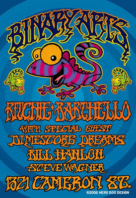
The poster is done in a 60's style music poster that was inspired by Rick Griffin's posters that were done for the Fillmore West in the late 60's.

The poster is done in a 60's style music poster that was inspired by Rick Griffin's posters that were done for the Fillmore West in the late 60's.
Friday, March 21, 2008
New Bags (Biodegradable)
We had the chance to get some new plastic bags for the library recently, and so I decided to do it more eco-friendly by getting biodegradable bags, which break down much quicker instead of traditional plastic that takes decades to break down.
Of course, I wanted to call some attention to this, so I put a small burst that alerts customers top this feature.
The greatest thing is that, after much price-searching, I was able to get these bags at nearly the same cost as the non-eco-friendly bags we have used in previous years.

Of course, I wanted to call some attention to this, so I put a small burst that alerts customers top this feature.
The greatest thing is that, after much price-searching, I was able to get these bags at nearly the same cost as the non-eco-friendly bags we have used in previous years.

Wi-Fi Available Here
The library just finished this massive project to get "wi-Fi" in all of our branches (22 branches) so people can surf the web via laptop when they are in any of the branches. This was a huge undertaking and is a great step forward technologically speaking.
Who would have thought ten years ago that the library would offer free internet, on demand, without cables.
Of course, we needed a sticker to help alert people of this new service, so I have designed a symbol that is easily recognizable. The sticker will be double-sided so it can be viewed from inside the window and outside and will be placed inside the glass so that people can't scratch it off as easily.

Who would have thought ten years ago that the library would offer free internet, on demand, without cables.
Of course, we needed a sticker to help alert people of this new service, so I have designed a symbol that is easily recognizable. The sticker will be double-sided so it can be viewed from inside the window and outside and will be placed inside the glass so that people can't scratch it off as easily.

All Fairfax Reads Stickers
This is the All Fairfax Reads sticker that I made recently. These stickers will go on most of the copies of the book that was chosen (The Uncommon Reader).
I think we have ordered about 2,000 of these which will last about 3 years.

I think we have ordered about 2,000 of these which will last about 3 years.

Subscribe to:
Posts (Atom)